Re-establish the brand
Throughout 2022, I was responsible for planning and executing the rebranding project for SmartRecruiters, under the direction of the newly arrived CMO. As the scope and requirements of the project evolved, I continually adapted and iterated in order to deliver the desired outcome. This included managing timelines, working closely with stakeholders, conducting research and analysis, developing visual identities, and ensuring consistency across all channels.
- Company: SmartRecruiters
- Project type: Rebranding
- Years: 2022 - 2023
Define a briefing
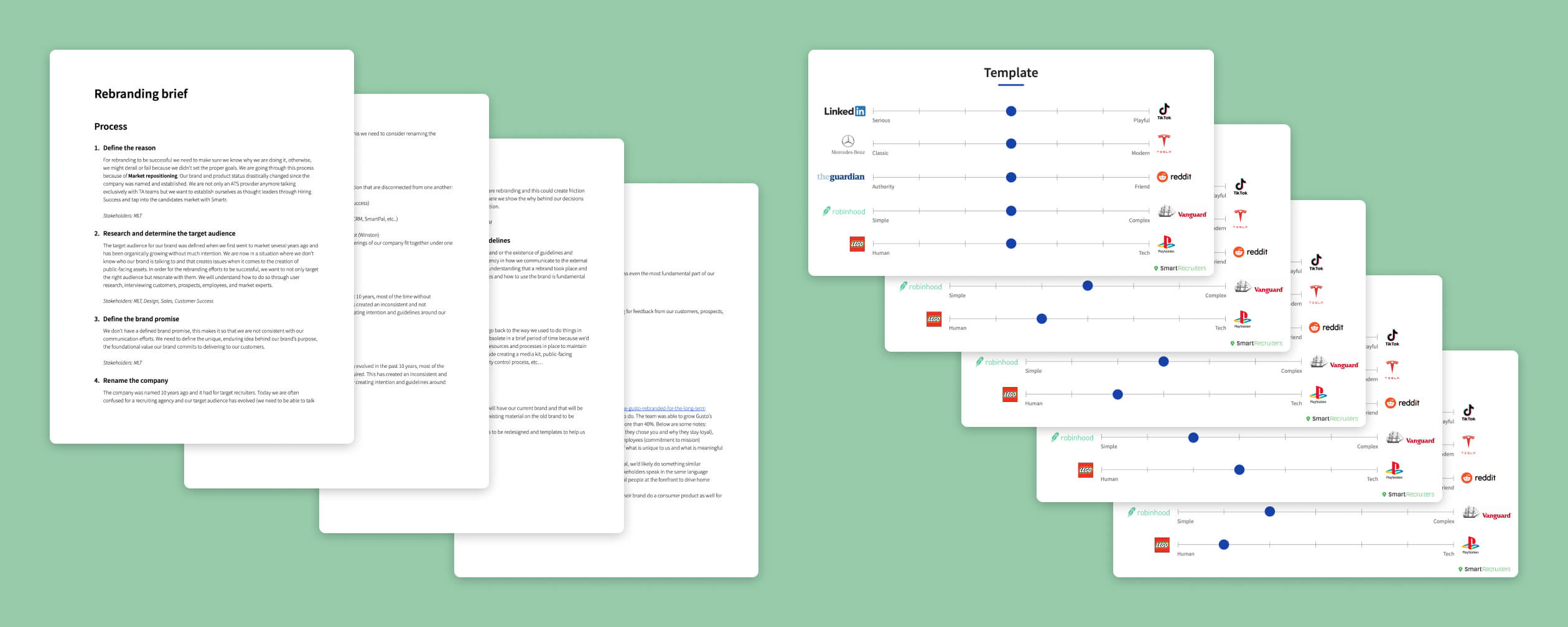
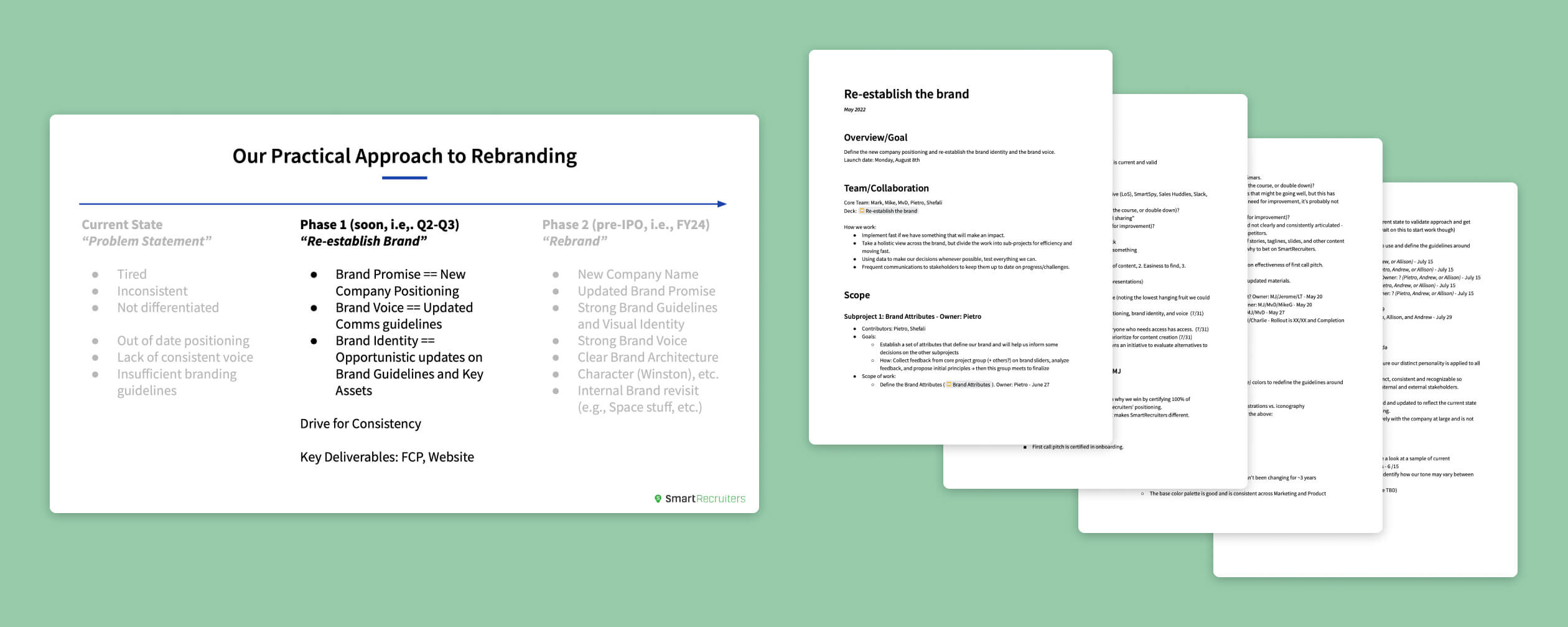
Re-evaluating the project's scope after a change in company priorities, we decided to focus on re-establishing the brand and making ad-hoc changes to address key pain points rather than investing significant time and resources in a full rebrand before the company's IPO, which would likely involve changing the company name.
Research and brainstorm
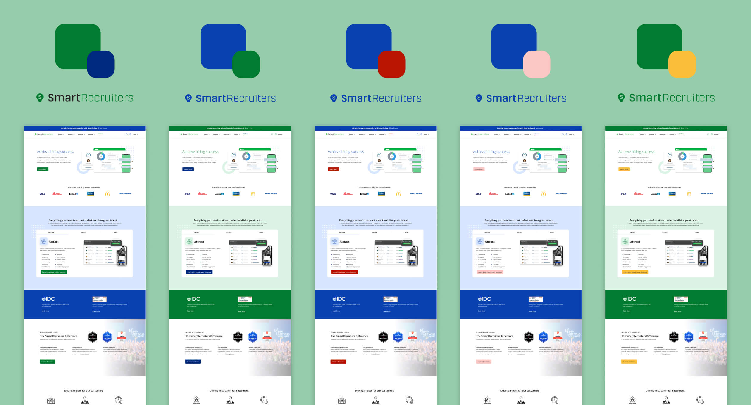
Our top priority was to address issues with our brand's color scheme. One of our primary colors had accessibility problems when used with text, and our two main colors were overly saturated when used together, which gave our brand an unprofessional appearance. We also lacked clear guidelines on when to use one color versus the other.
To address these issues, I conducted an analysis of our competitors' color usage on their websites and compared it to our own.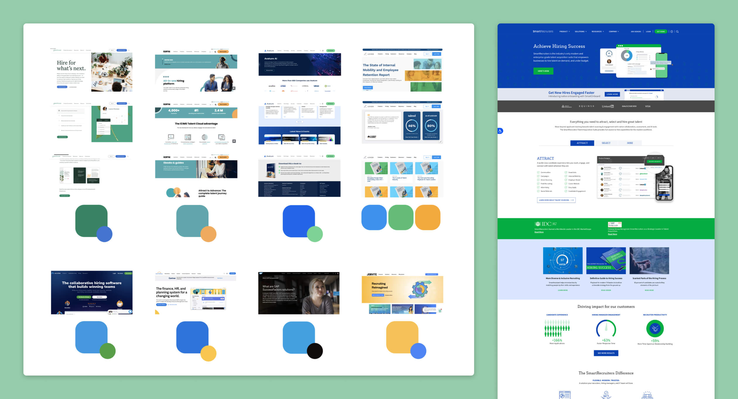
Collaborating with my team, we conducted brainstorming sessions and generated moodboards and concept ideas for various elements of the brand identity, including colors, layouts, typography, design elements, and iconography. We also applied these concepts to actual brand assets to assess their viability and ensure their effectiveness.
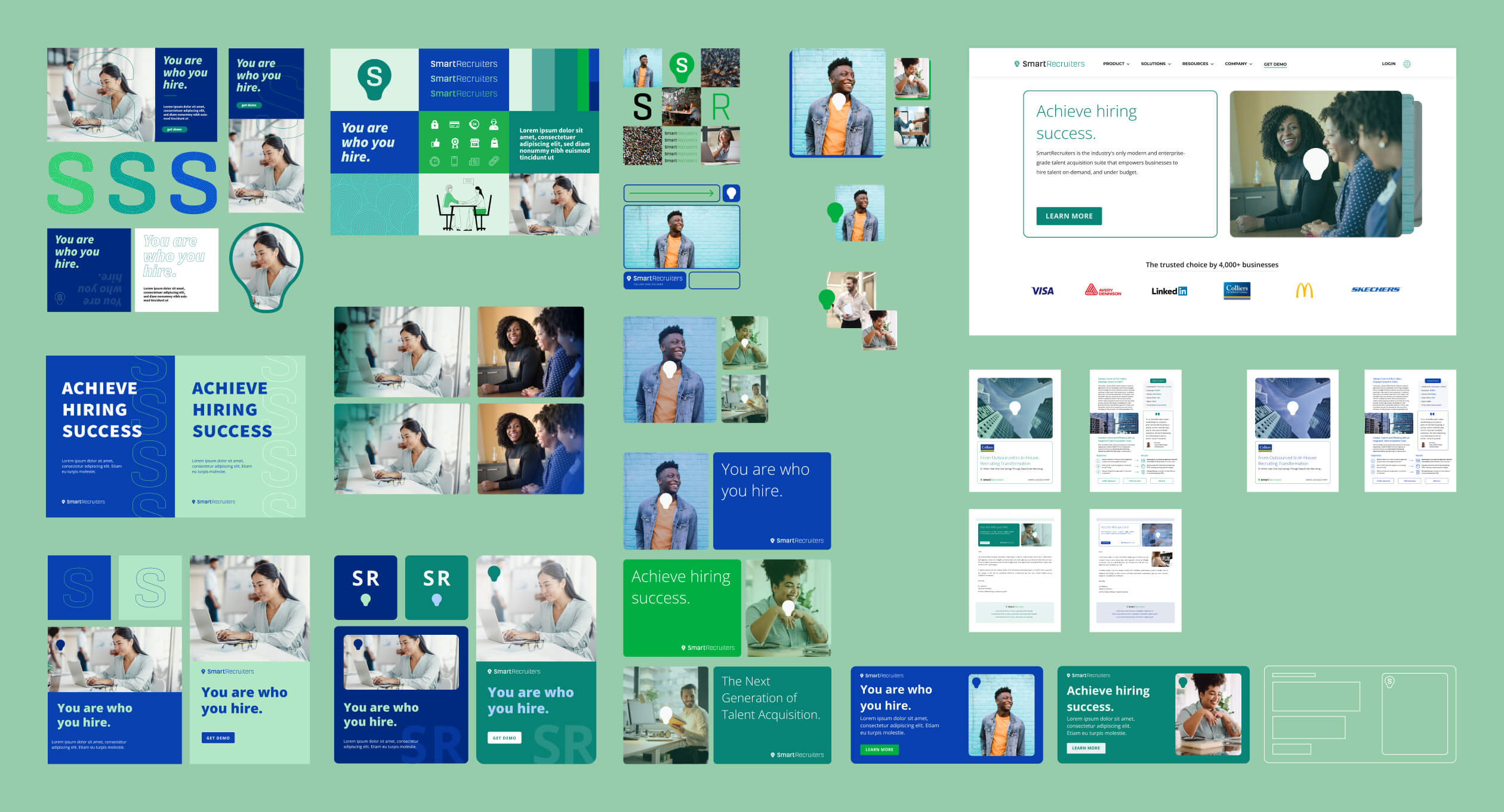
We also aimed to address the issue of our low-converting homepage, with the goal of improving the conversion rate to demo. We conducted a series of experiments on the homepage, trying out new color combinations, layouts, typography, and visual elements to find the optimal design that could achieve our goal.
Delivery
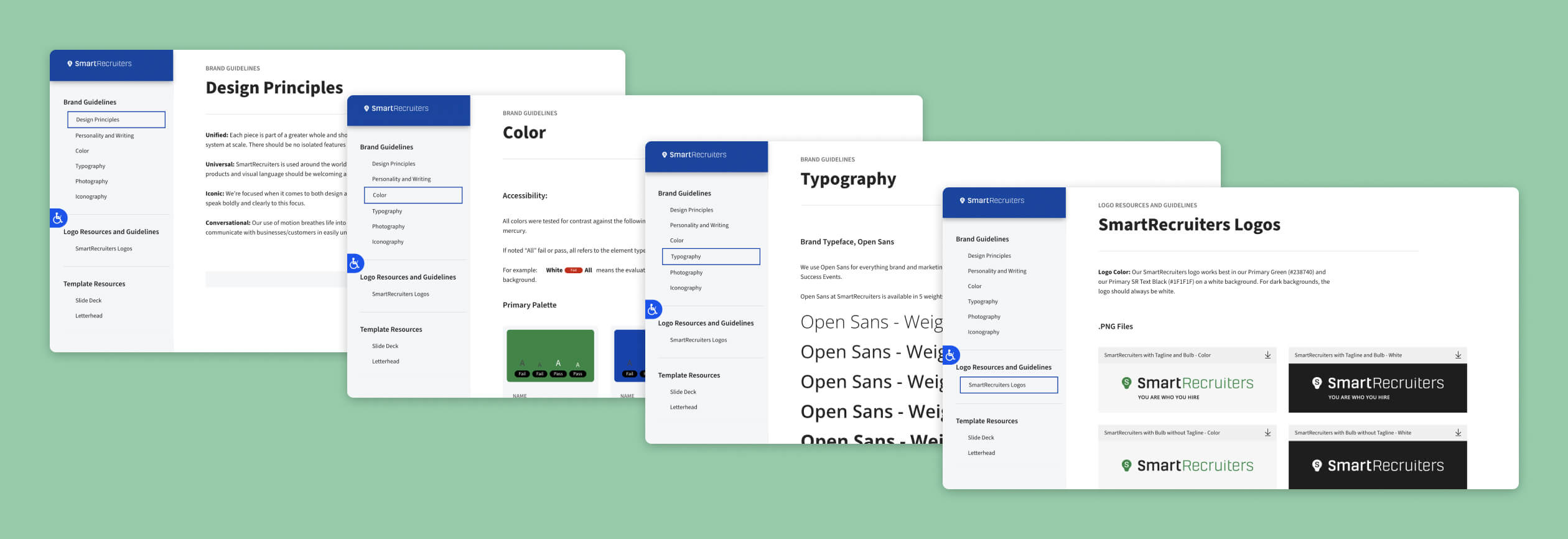
One more issue that needed attention was the inconsistency in font usage between our marketing materials and the product.
After conducting extensive research, we chose a new accessible green color and decided to switch to the font used within the product, to ensure consistency across all brand assets.

In response to feedback from our go-to-market team that our brand had become stagnant in recent years, we compiled a list of marketing materials that required updating. We then prioritized the assets that were used most frequently, including our homepage, PDFs, banners, and slides. This process allowed us to focus our efforts on refreshing the most impactful pieces of content first.
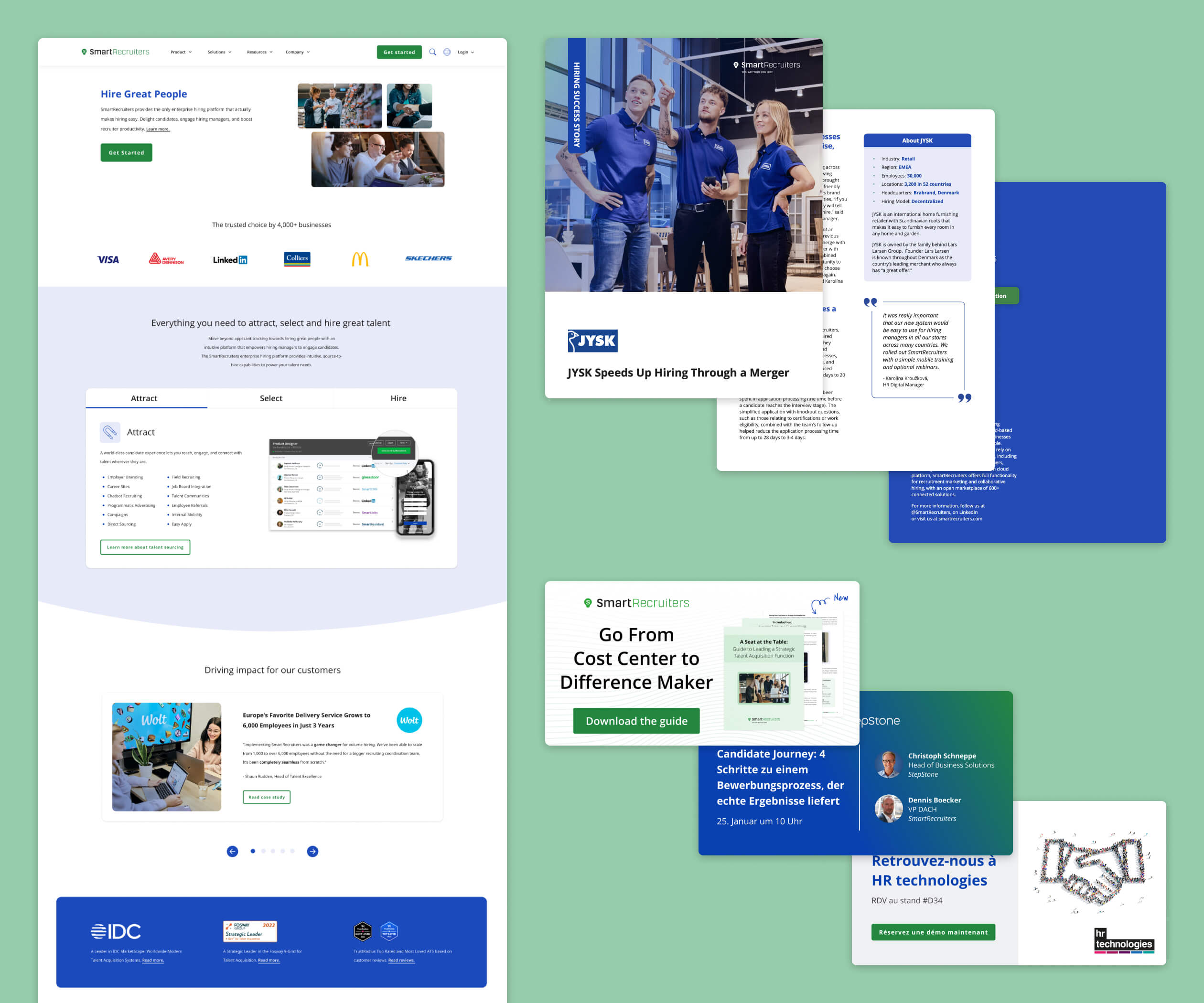
Through careful planning and collaboration, we were able to successfully execute a brand refresh for SmartRecruiters. Our efforts focused on addressing important accessibility issues, such as updating one of the two main colors, and harmonizing the font with the product. We also updated and modernized a variety of elements and assets, including the homepage which resulted in a 51% increase in demo requests in the first three months after the redesign. These achievements not only provided a better user experience for our customers but also strengthened SmartRecruiters' brand identity and positioning in the market.